Pixel 3
Designs for the release of the third generation of Google’s flagship phone. Working at Brand New School, I was asked to conceptualize a few sequences and create a look for the phone's release. I tackled how to highlight the phone's resistance to the elements and explored ways to highlight the materials of the phone. Exploration includes: sand, water, rock, concrete and glass.
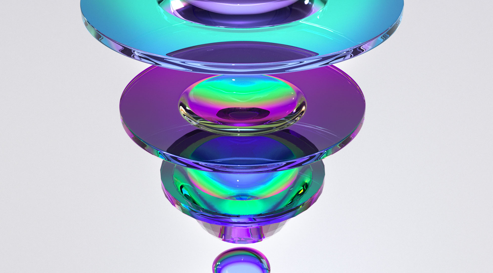
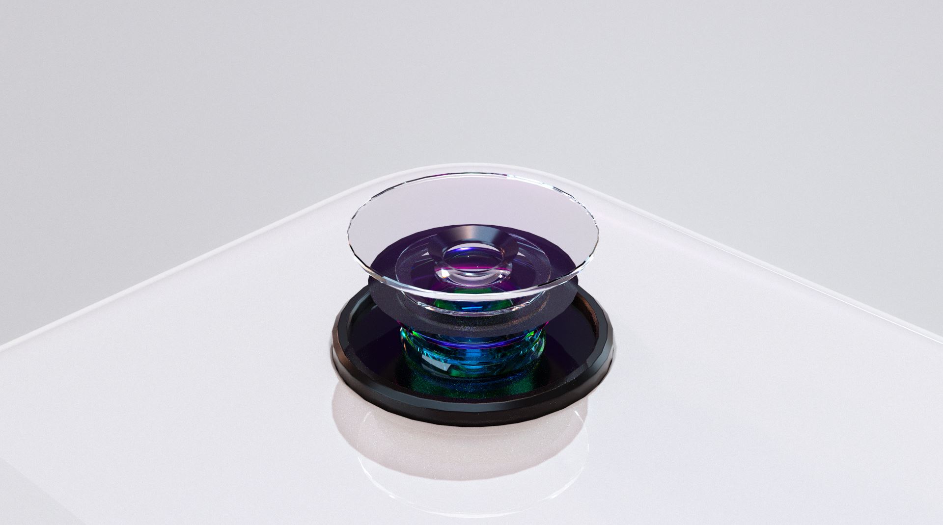
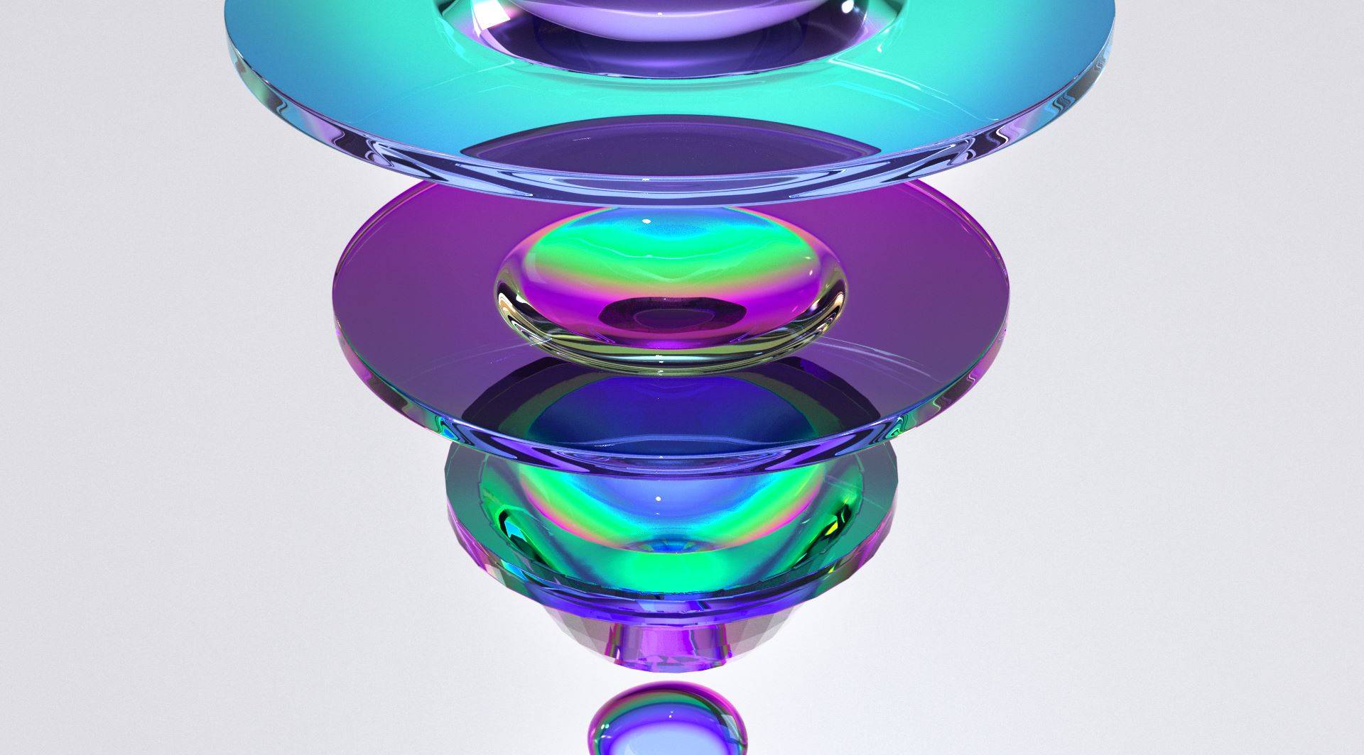
A sequence to highlight the formation of the camera’s lenses in a beautiful way. A drop of richly colored glass falls and warps to the shape of a lens. Color refracts and caustics light up the floor. The spot was quite feature heavy, so abstract moments like these served as a break between messages.
Director - Jonathan Notaro, Produced by Brand New School.

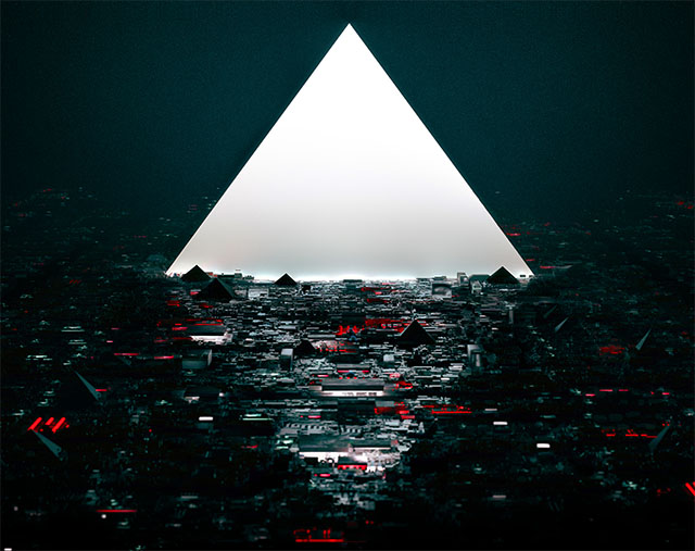
Stone
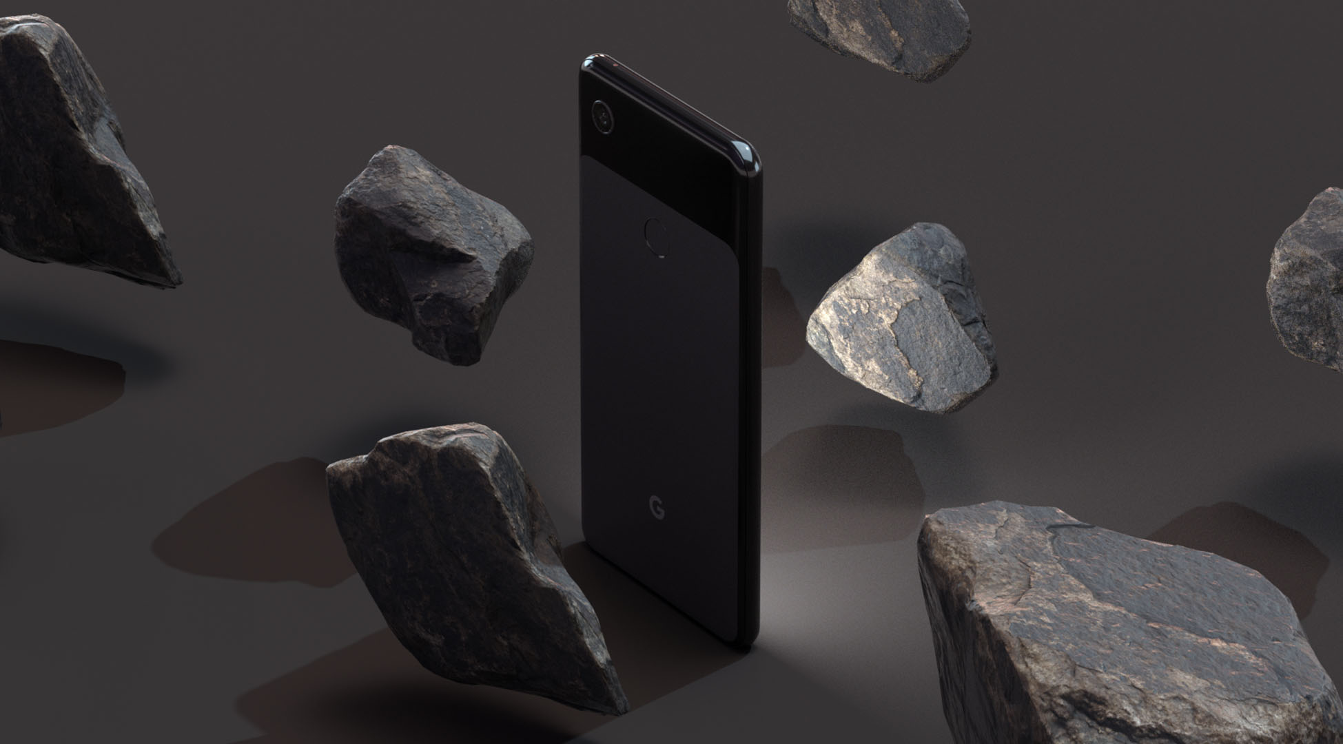
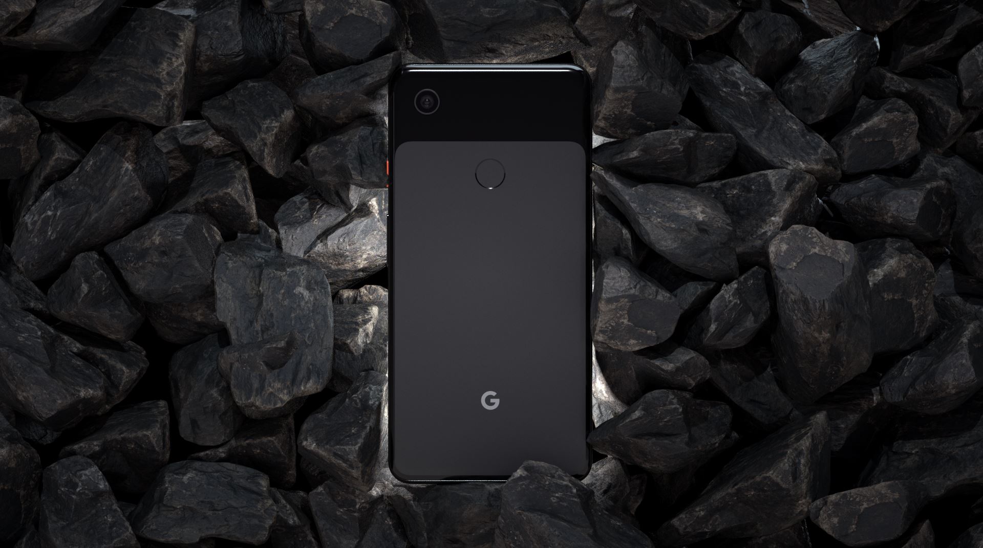
To highlight the scratch resistance of the phone, stone floats and ricochets from the glossy surfaces. Setting the black phone in a dimly lit space, I loved the idea of using the phone to illuminate the darkness.
Stone
To highlight the scratch resistance of the phone, stone floats and ricochets from the glossy surfaces. Setting the black phone in a dimly lit space, I loved the idea of using the phone to illuminate the darkness.

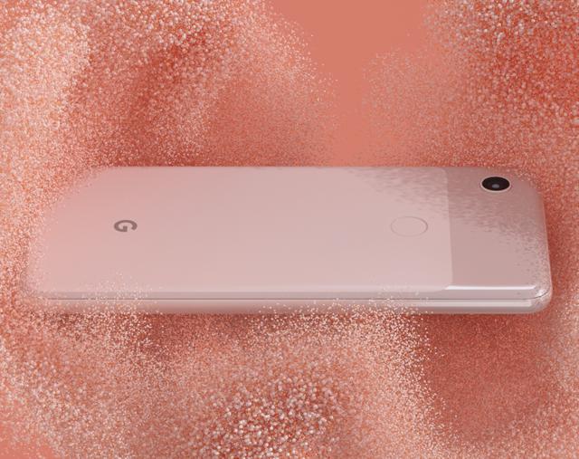
Sand
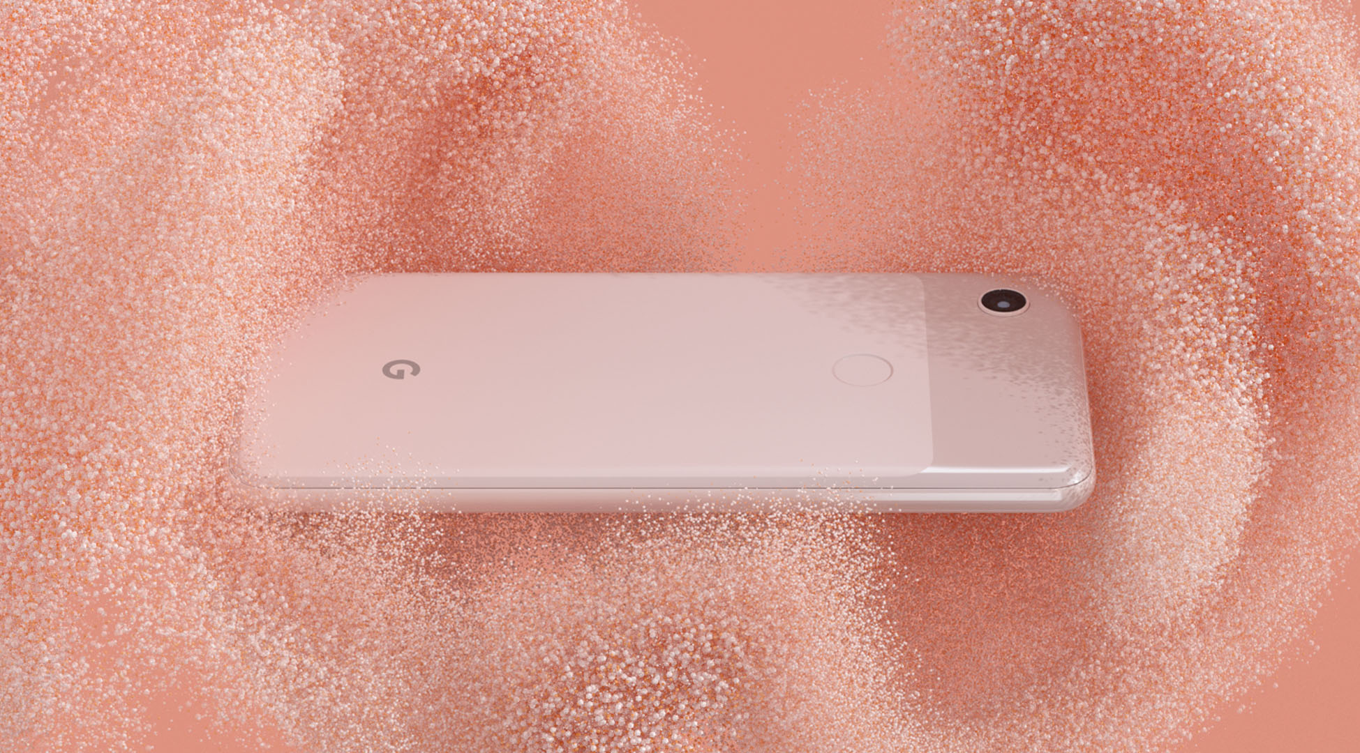
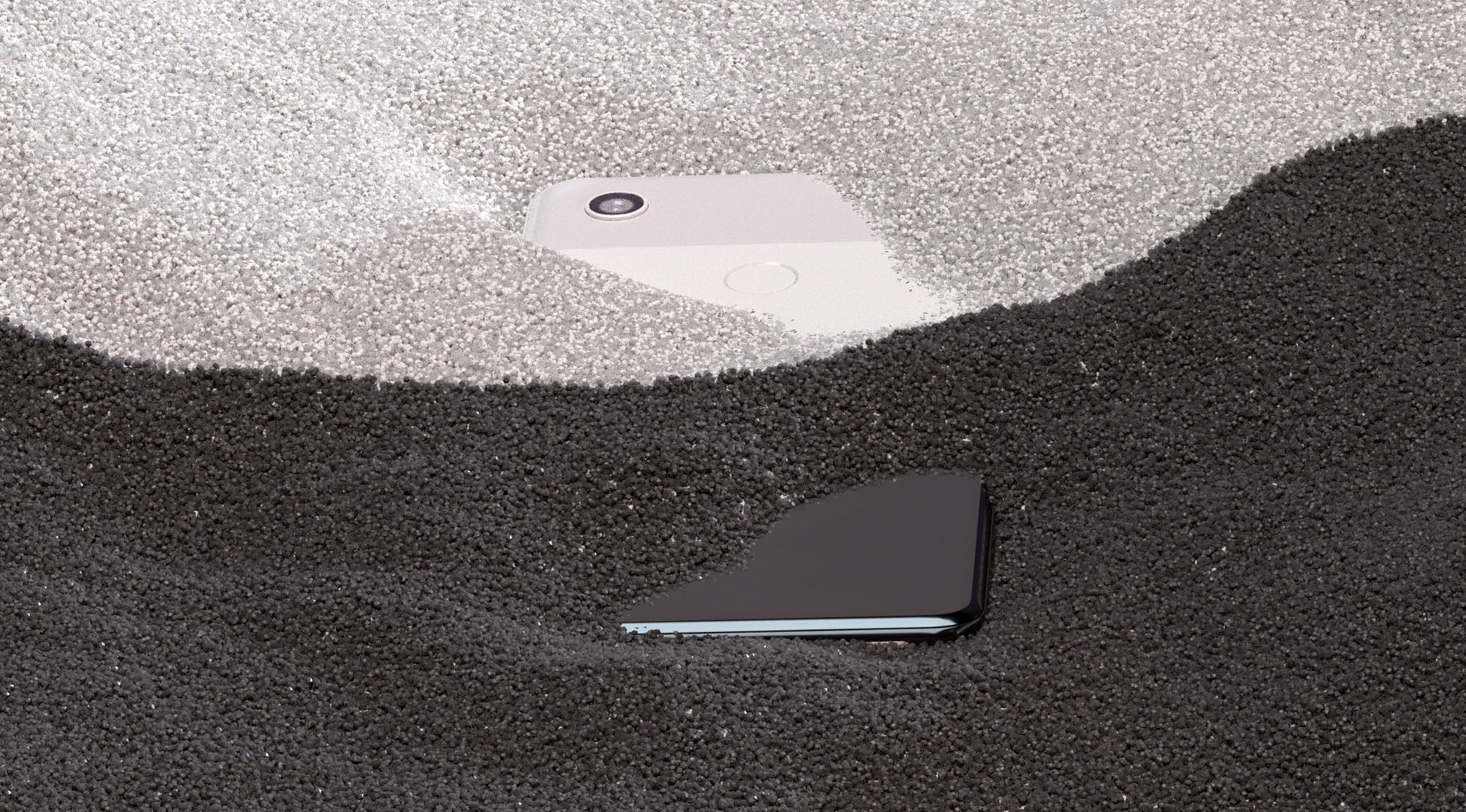
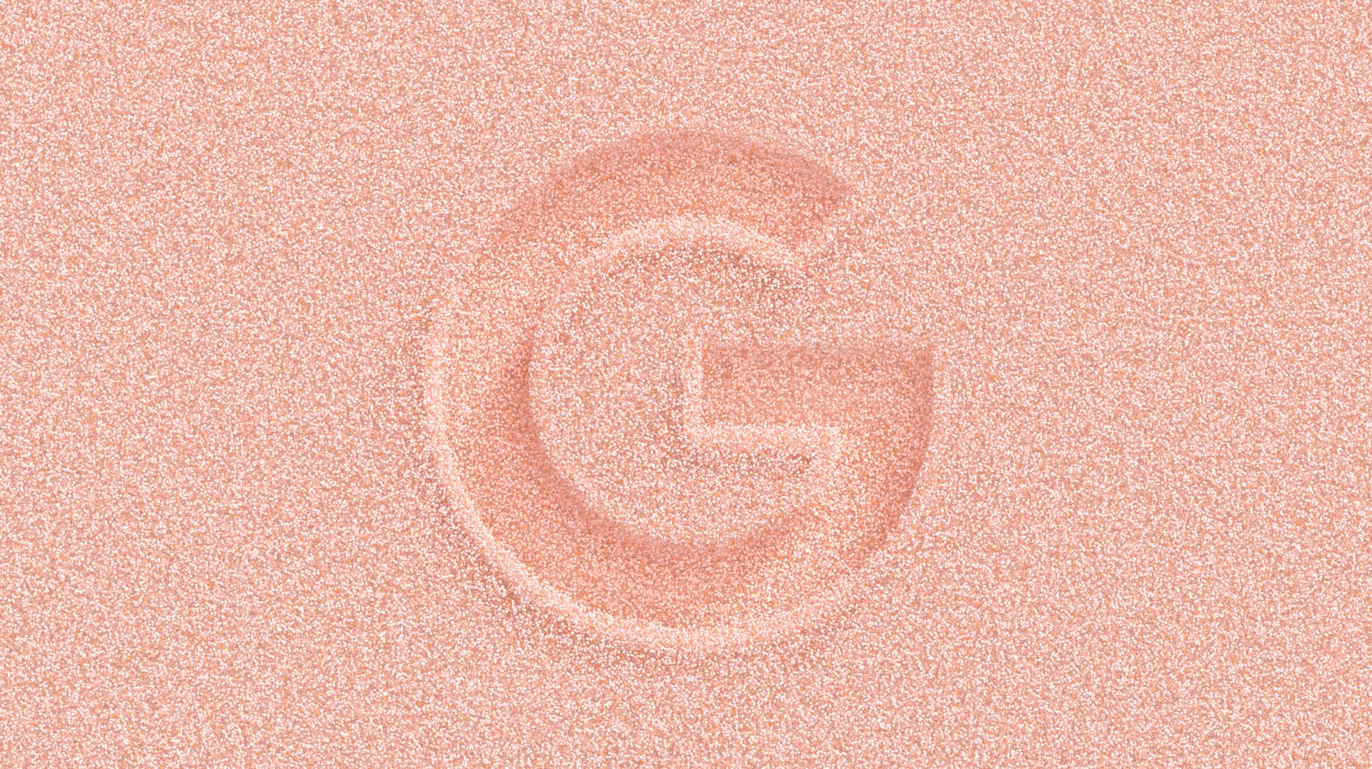
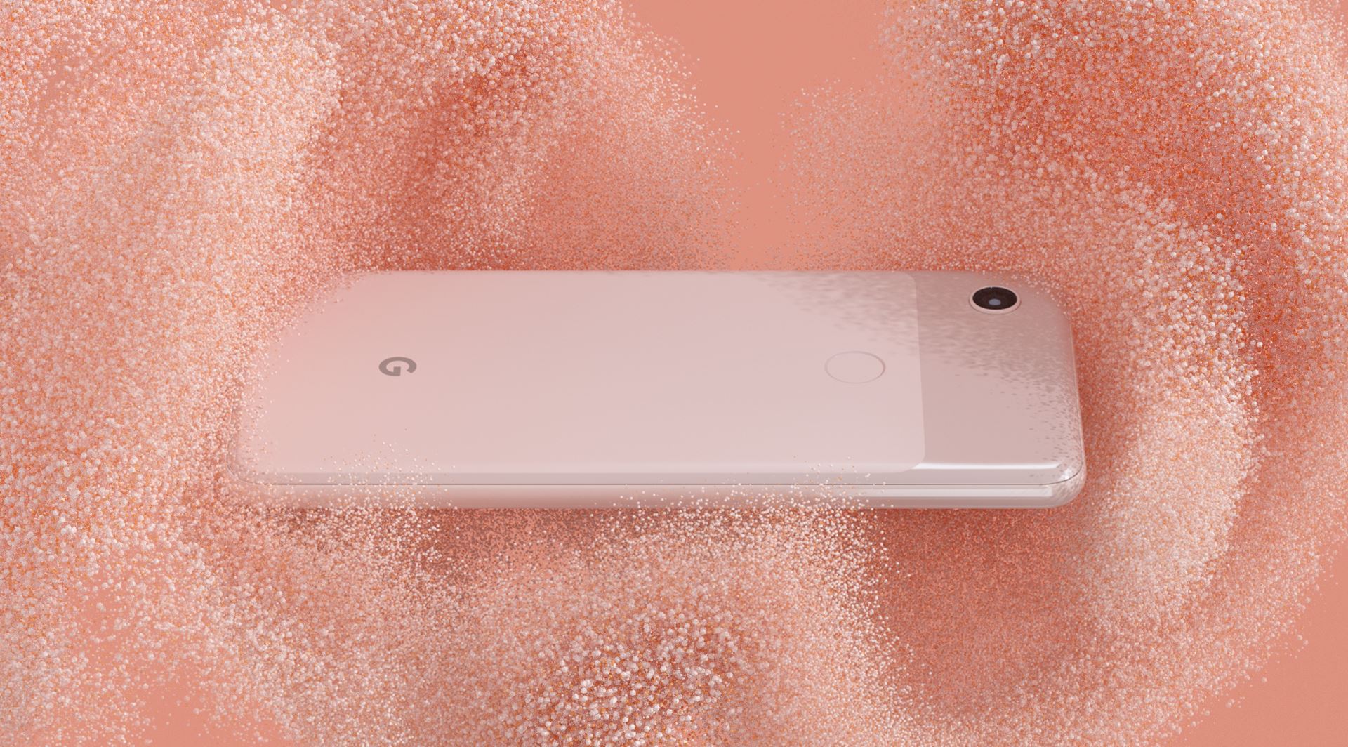
Google’s feature phone is a coral sand color. I wanted to create images full of energy, detail and clarity while still remaining graphic, simple and in line with Google’s branding. To represent scratch resistance, I used several simulation techniques and millions of sand particles. I was able to create vortexes and make lockups that took advantage of negative space, leaving footprints in sand.


Concrete
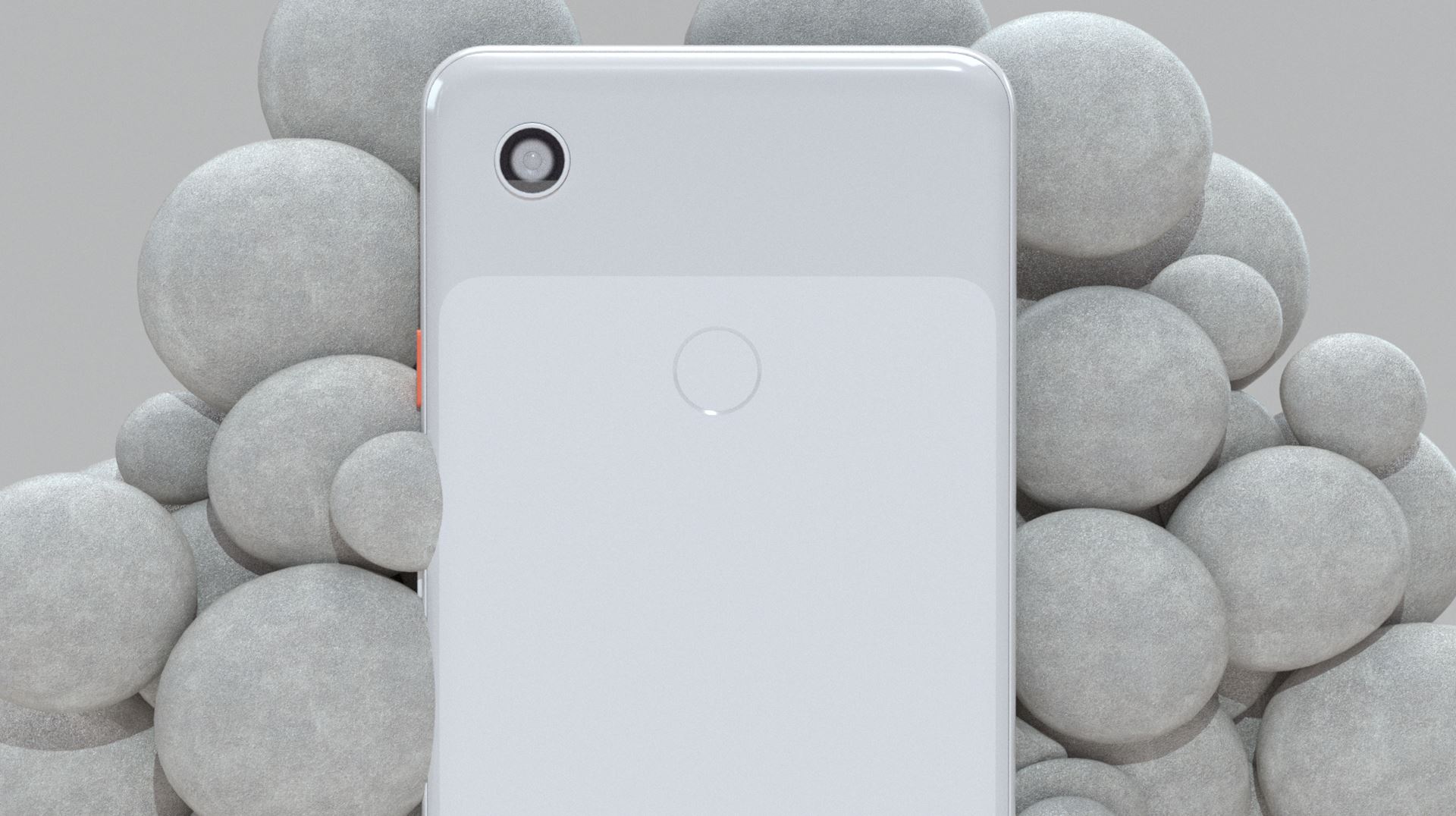
A more man made material exploration of scratch resistance. Bubbles of concrete bounce and coalesce around the phone. I wanted to try a more surreal approach and take an everyday material like concrete and give it surprising form and properties for motion.
Concrete
A more man made material exploration of scratch resistance. Bubbles of concrete bounce and coalesce around the phone. I wanted to try a more surreal approach and take an everyday material like concrete and give it surprising form and properties for motion.

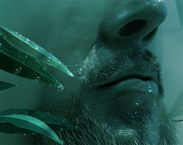
Water
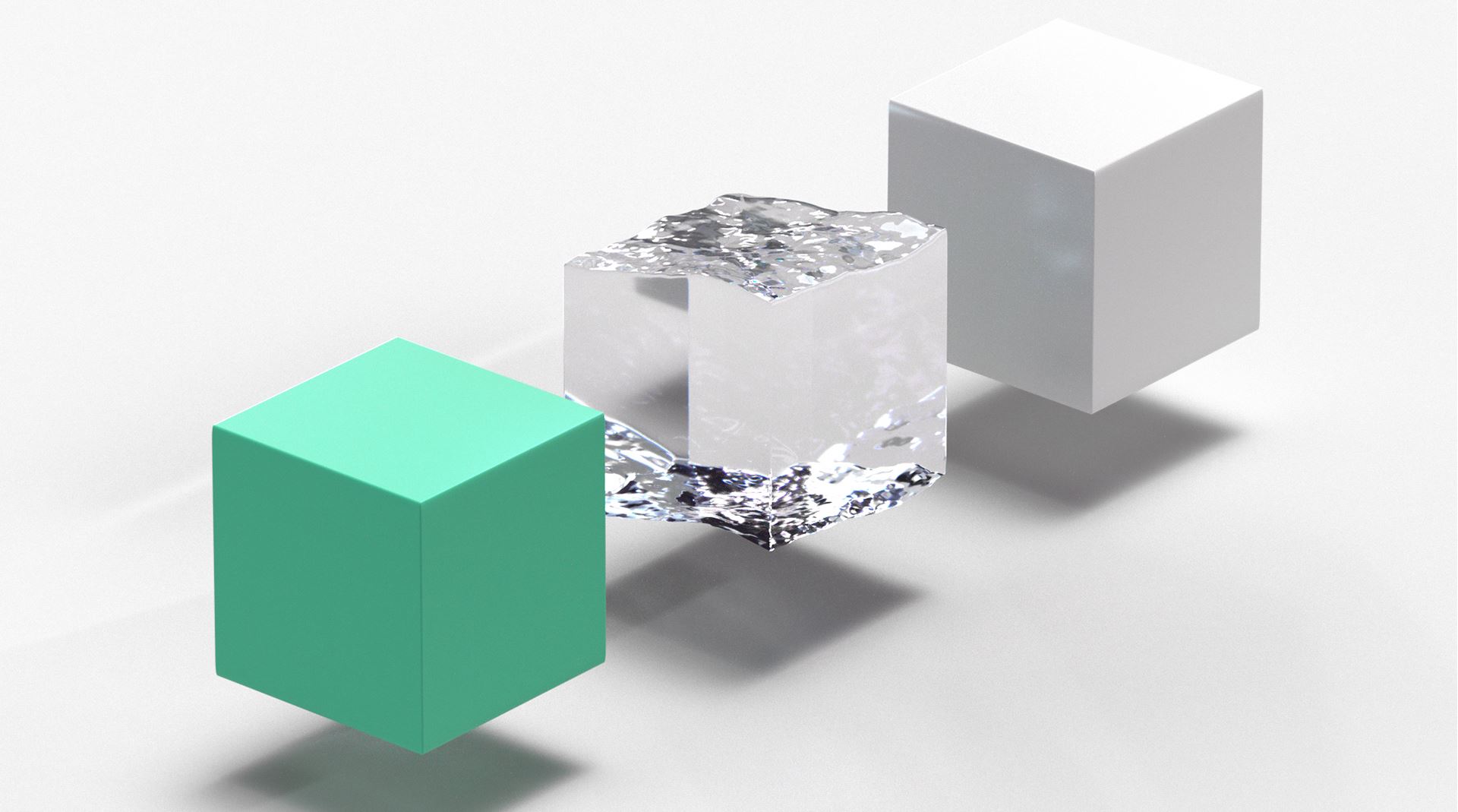
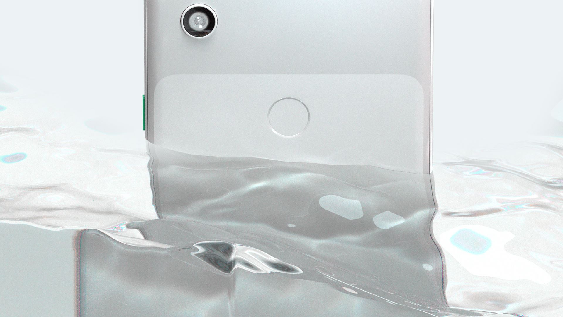
An exploration of water and how the phone refracts and distorts while submerged, using the clean white phone to add to the sense of purity. In a study of minimalism, the three cubes on the left represent the button color, glass and satin back of the phone.
Water
An exploration of water and how the phone refracts and distorts while submerged, using the clean white phone to add to the sense of purity. In a study of minimalism, the three cubes on the left represent the button color, glass and satin back of the phone.

tomalexbuch@gmail.com +1 (347) 774-6741

